Wednesday, April 29, 2009

No One Wants a Messy Mantle!

Ahh--the fireplace. It's a wonderful thing during the deep freeze of winter. These days, as the weather turns warm, we have little, if any, use for the fireplace. Behold -- it can still be a functional beauty. It is revelled as a symbol of hearth and home, an obvious focal point in any room -- and major decorating challenge for most of us. It serves as a great display area for treasured objects or collections, but the trick is to edit them carefully. As a rule, an assortment of thoughtfully arranged accessories on the mantle creates more of an impact than a single statement above it. Here are some tricks:

Keep it even: An assortment of lots of small items - flowers, candlesticks, photos, figurines - can look like clutter. Make groups of uneven numbers and you've created instant eye appeal from across the room.

Keep it simple: Simple is in. Stick to simplicity on large items and repetition in color, shape or subject for smaller items. A single beautiful mirror or a grouping of small leaning framed prints or images always looks great and avoids the cluttered look.

Fill in: Alternating larger items with smaller objects bring people in for a closer look.

Avoid the black hole: Stack the grade with fresh firewood and avoid displaying old ashes. In warmer months, conceal the firebox with a decorative screen or an interesting object. Remove the grate and replace it with an assortment of pillar candles of varying heights, a wicker basket or a stack of papery white birch logs.


Sunday, April 19, 2009

The Mystery Behind Picture Groupings

Little in your home reveals more about you than what you hang on your walls. Paintings, mirrors, and photos bring pattern, color, and personality into any space. But grouping objects to fill vertical expanses can be a real challenge.

Start by trying out the arrangement on the floor first and stand back to see how it looks and shift them around till you find the most pleasing balance and scale. For example, two vertical columns of three frames each, with the middle one at eye level, will make a space seem higher. The key to creating a cohesive gallery effect is keeping the frames' sizes, colors, and mats uniform. You can also try out the layout first by cutting templates of the frames out of cardboard or paper and hanging the shapes on the wall with tape first to create the desired arrangement. Then replace the paper with the real frames. That way you won't have to patch all the nail holes once you've finished. Trust me been there, done that.


Today’s groupings tend to be more interesting and varied than those of a few decades ago - some are very structured while others are freeform and a lot more innovative


The grouping to the right comes from Traditional Home magazine. There are a few creative things going on here. First, the display carries from one wall onto another that projects out from it. Typically, we see groupings all on one plane so this is a unique look. Second, a shelf was incorporated into the grouping. This provides a resting spot for two of the frames as well as a place for a 3-dimensional object. Both the shelf and the fact that the art is leaning adds dimension to the grouping. Third, the frame at the lower left is sitting on the floor, leaning onto the wall. This is a great look, but avoid using it in confined areas where it might be a happy-hour hazard. If the shelf was removed and the stool was pushed back to the wall, it could become an easel of sorts, with art displayed on the seat, leaning against the front of it, or both.


Balance vs symmetry
: There are 2 collections of art displayed on each side of the fireplace. They are NOT symmetrical, but they still feel balanced. Not everyone has the luxury of buying ALL the frames they need for a collection like this all at once. It's much more likely that you would have collected all of these pieces over time, so the chances that you will have exact frames to create the same arrangement on each side of the fireplace is slim to none. So, instead you aim for balance. Do both arrangements look similar in size, shape, color, etc.


Mirrors on the wall: Not only can mirrors make a small room appear bigger, but mounting a matching assortment of them can create a stylish alternative to a large piece of art.


Planning and coordination are the keys to successful artwork displays. Here, Houston designer Kathy Andrews selected black-and-white and sepia-tone photos that have water as a common theme. “I had them all matted identically, and hung them in similar black frames,” she says. To create a balanced composition, first position the largest works, then add smaller ones, maintaining a similar amount of space between the frames. Use existing architectural details—doors, windows, and trim—as guides. The oil painting above the settee, for instance, is situated so that it tucks into a right angle formed by the molding.

Another great resource to designing gallery walls is Pottery Barn's Design Tips. Here is a link. Check it out! http://www.potterybarn.com/stylehouse/decorate/mem_wall/index.cfm?cm_type=snav
Just have fun and let your creativity flow. Or, if you need help, call me!

Tuesday, April 14, 2009

Finding Your Color Palette

My first inclination that I had a passion for interior design started with color. Color has the power to transform a space as well as our own mood and delight our senses. Color is the decorating glue that holds a home together. I love designing color palettes. I feel strongly that the colors of the home should work in harmony and flow from room to room. There should be a tonal element keeping the eye at rest while using accessories to tie it all together and add the pop or wow factor. A beautiful scheme – even if it’s as simple as different shades of white—can make your whole house seem thoughtful, well planned, and organized.

Even though color plays such an important role in the way our homes look and how we feel about them, there are no definite rules about finding the right palette. Color choices are personal; start with what you love. In the end, what works for you is the right decision. Deciding on a scheme doesn’t have to be overwhelming. There are reliable ways to find the colors that please you.

Explore your emotional responses to color: What moves you? What makes you happy? Or calm? Or energized? A beautiful painting, a favorite shirt or tie, a favorite shade of lipstick or nail polish--just about anything can serve as a great inspiration. I think a great place to start is the view from your window. I have a client who has great water views from three side of his home. What better inspiration than the colors of nature from that perspective. Green and tan reed grasses, blue-green water, blue sky, sunsets. Using colors from nature is a sure winner. Mother Nature has perfected that palette. Another great place to find inspiration is in your own closet. It tells you what colors you like to be around day after day.

Paint is the quickest way to bring color into you home, is inexpensive and easily changed. Just experiment until your satisfied. My husband likes to tell friends how we lost square footage in our first home because I changed the wall color so often. I have found my favorites since then.

One of my strongest words of advice is, whatever you decide to use as your palette, keep it unified and flowing from room to room. One no fail trick is to use the FOUR COLOR METHOD: When you plan your color scheme, think of creating a layered palette of shades and colors. Begin with a central color, then introduce three more colors. (1) wall color, (2) molding and trim color, (3) fabric on sofa, and (4) accent pillows an draperies.

Here are some of my favorite inspiring palettes to consider.

Classic

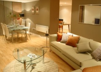
Cream, Camel, white and black

Modern
Olive green, pale grey-blue, khaki, and orange or rust


Another possible combo


Outdoors/Garden
Pale tones of blue, green, parchment, and silver

Beach
Pale or turquoise blue, white, and sand with a small splash of coral or orange

Sexy

Lilac, white, gray, and eggplant

Handsome

Khaki, deep red, white and black

Wednesday, April 1, 2009

Small Is In - Making the Most of the Space You've Got!

It is possible to live large in a small space. Space-challenged rooms have earned a bad rap, the truth is the can be the most charming. Think of them as special, not small.
More than in any other room, the trick with small spaces is to use the space you have wisely; to play up any qualities it may have, such as beautiful moldings, a fireplace, or a pretty view; and to choose furnishings and storage solutions that are in scale, that function efficiently, and that are pleasing to the eye. A small space might not require much furniture, but what furniture it does have must work overtime. Simply adding one stunning piece of furniture can change the whole feeling of a small room. Look for furnishings that can do double duty--a coffee table that can be raised to dining table height, and end table with lots of drawer space for plentiful storage, a smaller scale sofa.
Without redcorating at all you can make the space more comfortable and tranquil by clearing it of all visual clutter. If removing the visual clutter doesn't do the job try reducing the number of pictures on the wall or collectables on the tables until you have created a space to rest the eyes. A small room is the perfect opportunity to balance beauty and necessity.


Here are simple decorating tricks you can use to give rooms that seem crowded the illusion of space.

Furniture Layout
Less is more. If you place too much furniture in any room, it will look crowded and feel smaller than it really is. Make sure to leave plenty of empty space around your furniture so the room seems less crowded. When selecting new furnishings, choose items that serve multiple purposes, such as ottomans that double as serving trays, so that you can enjoy functionality without clutter.

Painting for the Illusion of Space
When you want to maximize the appearance of space in a room, it's vital to choose your paint colors wisely. Many people don't realize that warm shades are the best choice for smaller spaces. There are also a number of painting techniques that you can use to help a room appear larger. For example, using light colors on three walls and painting the fourth wall a darker, complementary shade adds depth to an area.

Lighting Matters
The way lighting is used within a room has a significant impact on how spacious the area feels. Rooms that don't have sufficient quantity of natural or artificial lighting tend to feel small. Bringing light into a room is a great way to open it up. One way to make a room seem larger is to direct ambient lighting on the walls. It's also important to make sure that you aren't closing in your space by using heavy, dark curtains that keep light from being able to spill into the room.

Decorative Elements
Utilizing reflective surfaces to decorate a room can also help make the area seem larger. For example, using mirrors as wall art instead of art can make a room seem more sizeable. Decorating with clear glass and crystal candleholders and vases can also contribute to a feeling of openness.


www.hgtv.com "small space, big style" Before and After


www.indedesign.com